Color Theory: A simple guide (or maybe not)
A complete guide to color theory: what color is, primary colors (CMYK, RGB), secondary colors, hue, saturation, value, color psychology. The meaning of colors: yellow, blue, white, gray, brown, orange, black, red, pink, green, violet.
The team behind Polimake. We explore the intersection of technology, creativity, and automation.

Applied color theory: how to use color to sell better and communicate clearly
Color theory: What is color?
To understand color and its theory, we have to start with its definition. According to the Real Academia, color is the "Sensation produced by rays of light striking the visual organs."
The reality is that the world has no color. We only have surfaces that capture and reflect light, holding on to specific colors. What we need to take away from this is that color is just a perception. By understanding how humans perceive color, we can move on to justifying and grasping color theory. Color theory should be integrated into your marketing plan and complemented by your visual communication strategy to improve communication and brand identity.
The light that interacts with surfaces is made up of three basic colors: red, green, and blue. This phenomenon can be seen when we pass a beam of white light through a prism, or in the spectrum observed in a rainbow.
What are primary colors?
The eye is only sensitive to three colors. This is because of the three types of visual cells we have. They are called primary colors (blue, green, and red).
They don't arise from mixing any other color, which is why they're primary colors.
As you can see on the left, the three colors combined form white.
Source: Norden
Subtractive primaries: What is CMYK?
CMYK stands for Cyan, Magenta, Yellow, and Key (Key, or Black). It also matches the colors that appear in your printer's ink cartridges. These are the subtractive primary colors. That's because they subtract colors from white.
To understand it, think of the sheet of paper you print on. Without putting anything on it, you print on a blank sheet. Light hits the paper and reflects back to our eye: white. By adding color, you're blocking or covering the white sheet. The more color or layers you put on top, the more you're subtracting or covering up light from the white. If we add many colors, or all the colors, onto the white, it gets so dark that it becomes black (it blocks the light).
The easiest way is to think of CMYK with percentages from 0 to 100. If C=100, M=100, Y=100, and K=100, you end up with black. But if all four colors equal 0, you end up with white.
Additive primaries: What is RGB?
RGB color models are designed for electronic screens, and it's how we perceive color in the eye.
RGB stands for Red, Green, Blue, or Red, Green, Blue. Unlike the previous one, it's based on the additive color model. This means that the more color you add, the closer it gets to white.
In the case of computers, RGB is created using scales from 0 to 255 (just like a percentage). So black would be R=0, G=0, and B=0. White would be R=255, G=255, and B=255. It's additive because screens start out black (or off), and the tiny pixels light up with electricity, giving off light. Using RGB for screens and CMYK for printing is the key takeaway of this section.
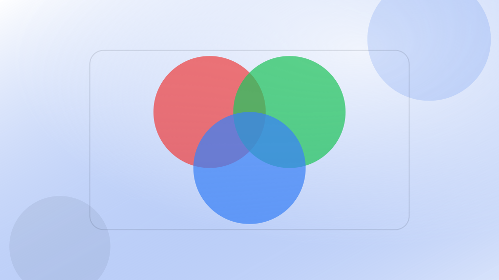
What are secondary colors?
Secondary colors are the ones formed by mixing the primaries. You can combine them in many ways and get new colors. If you combine those again, you get tertiary colors.
Before talking about the meaning behind color theory, we need to know a few of its characteristics.
What is the hue of a color?
Hue is the name of the color itself. It's the quality that defines the color. For example, green, blue, or red: that's a hue. It's also called tint. It's the name of the color as such.


We can say there are warm hues and cool hues. Warm ones are those that convey heat. Think of a fireplace or fire. Colors like red, yellow, and oranges. Cool ones are blue and green. Hues that bring to mind ice or snow. This can be adjusted to convey feelings.
What would the saturation of a color be?
Saturation is the purity or intensity of a color. If we add other colors to a color, it becomes more "diluted." Just like concentration in a liquid. The more saturated a color is, the purer it is and the less "diluted."
What is the Value of a color?
Value refers to its lightness. The whiter it is, the greater the lightness.
Psychology and color theory
Within color theory, we can talk about the psychology of color. That's because, since it's a perception, each person understands it in their own way.
Different theories exist because they depend on many factors. Our culture, our experiences, and biological values define it. Reading online, you'll find that some theories contradict each other, since depending on our environment, a color can convey completely different feelings to us.
For this reason, when we choose colors for our designs, marketing materials, and so on, it's good to understand what they might convey. It doesn't mean you have to follow it 100%, but it is important that you know the theory. To that end, we've put together a mini-guide with infographics. This is especially important for corporate design and brand identity.
What do colors mean?
As we've insisted, colors don't represent static perceptions. They can vary enormously, but the most common values are the following.
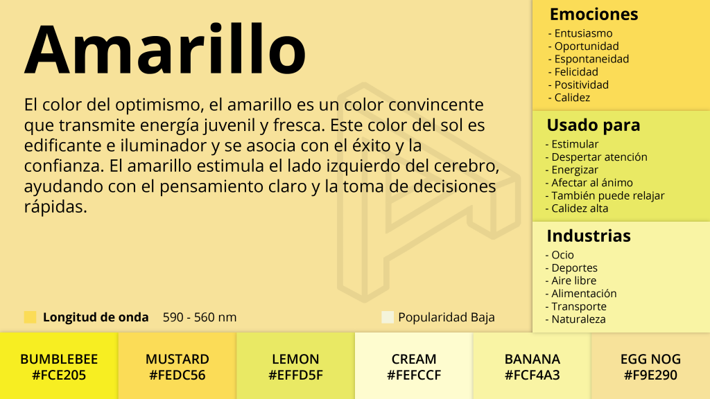
Yellow
Yellow has been linked to intelligence, creativity, and attention. It's a color of bright, warm tones. It's often associated with the sun and also with joy.
In design, it's used to grab attention, usually together with red. Even so, it shouldn't be overused. Too much yellow makes people impatient, and too little yellow causes negative feelings. So it's best to use yellow in a balanced way in your designs.
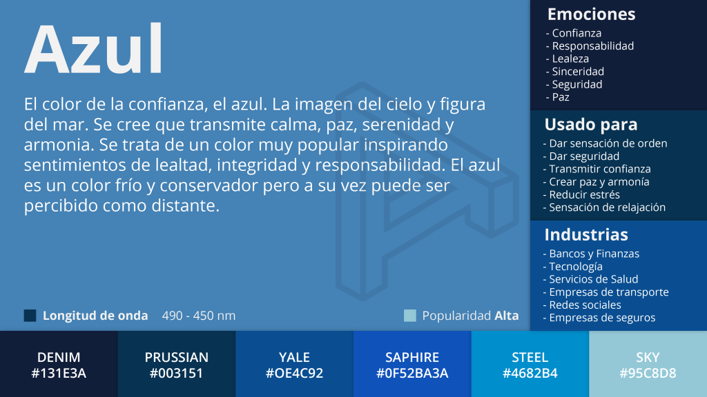
Blue
Blue, on the other hand, is the cool color par excellence. It symbolizes freshness, calm, and rest. If the most direct association of the previous one is the sun, this one is water and the sky.
Tranquility, purity, depth, serenity... are some of the adjectives associated with it.
A relaxing color that inspires peace, freedom, intuition, and loyalty. In design, this color has been used the most; it's a highly corporate one.
If we use brighter shades, it conveys dynamism; if, instead, we use a very dark one, we achieve the opposite.
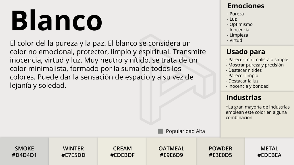
White
The color white implies innocence, purity, and simplicity. It contains all the colors of the spectrum and represents the positive and the negative of each of them.
Associated with light, this color is a symbol of clarity. Using white in design makes it look simple and clean. Apple changed the trend in design, and white was the color.
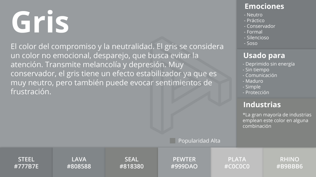
Gray
Gray is a color that sits in the middle between white and black, and it conveys exactly that: neutrality. It doesn't carry visual weight, which is why, in the right measure, it can convey elegance, luxury, and balance. Because it's such a neutral color, we shouldn't overuse it in design.
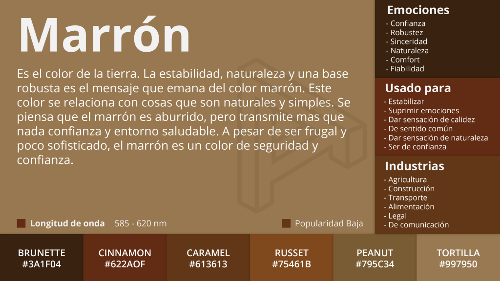
Brown
The color of autumn and of the earth. It's often associated with a masculine character. With its earthy tones, it's related to green and to nature.
Orange
A warm, active, radiant color. It's very useful in small doses, since in large amounts it's bold and aggressive. It's a color frequently associated with appetite—hence its recurring use in food-sector brands—and it also evokes fire and the heat of a flame.

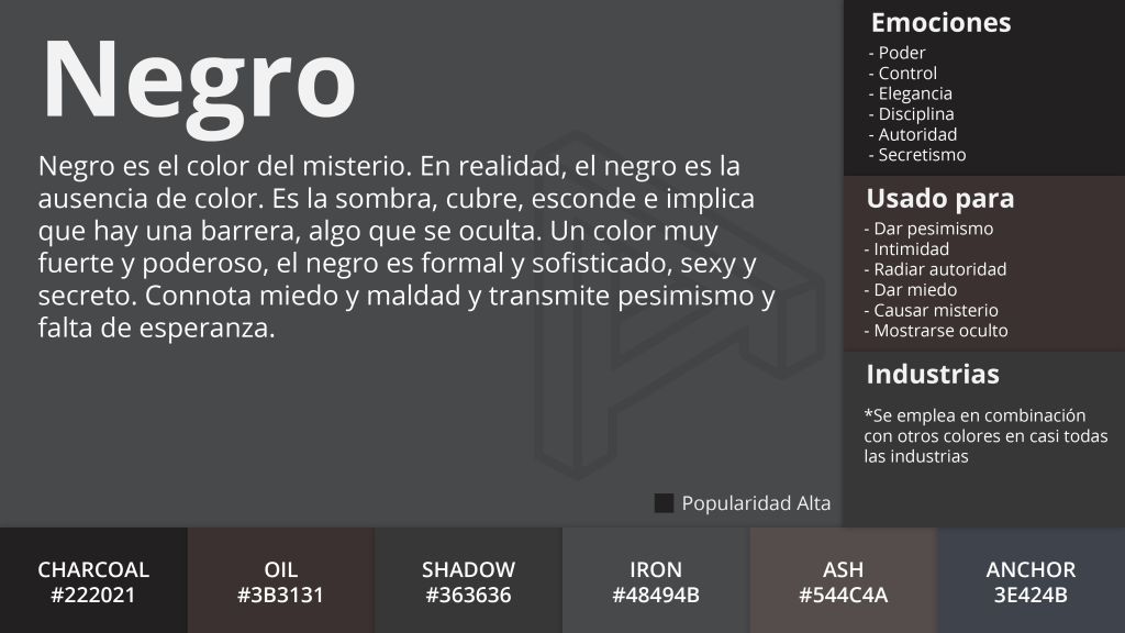
Black
Black is the absence of color. Darkness, shadows, and respect. It can convey strength, authority, sophistication, and elegance, but also death and evil.
In food, black is gourmet, and white is purity and healthier eating.
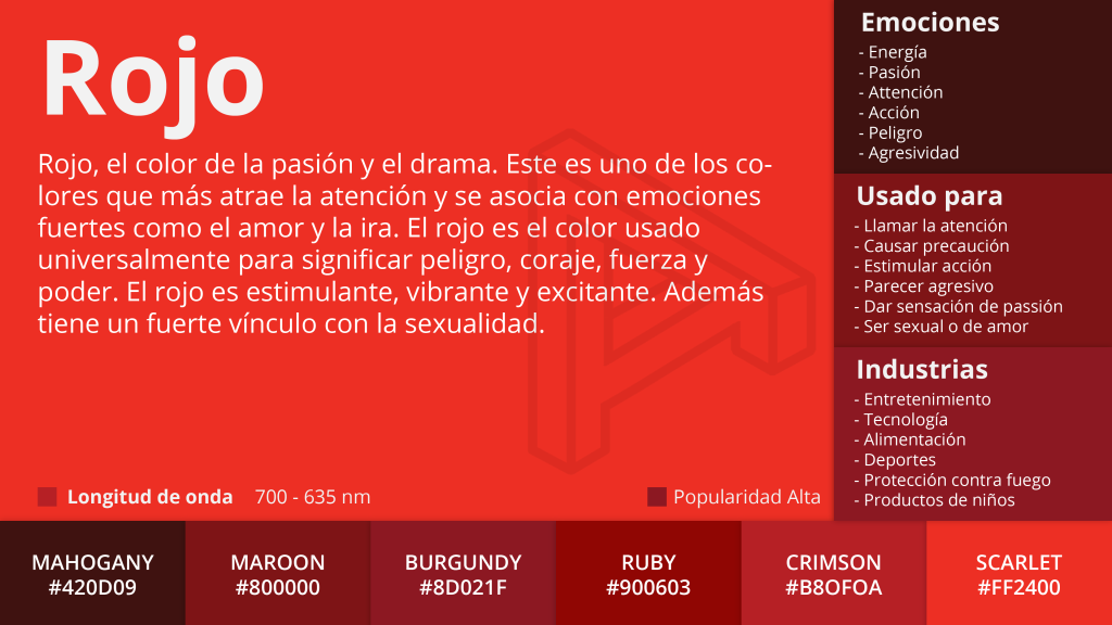
Red
If blue is the coolest hue, red is the warmest. It's an intense color, for better or worse. It can be associated with fire, blood, or sexuality and love.
Red screams passion, energy, love, desire, and determination. That's why many countries incorporate this color into their flags. In fact, it's the most popular one. Grabbing attention is its most common use in design. From warning or danger signs to "buy now" or "click here" buttons on the internet.
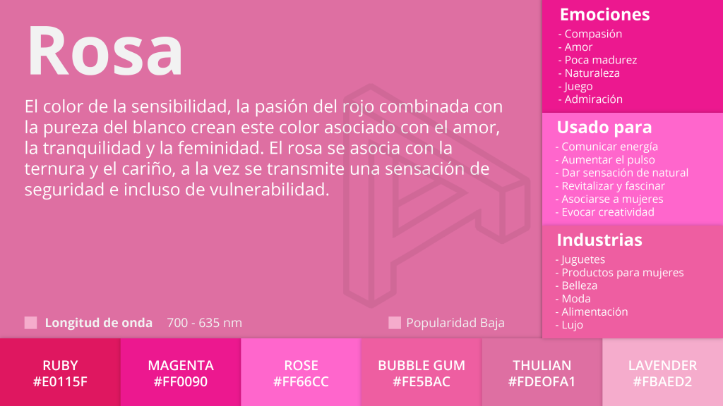
Pink
Pink communicates energy, creativity, and the passion and strength of red. It's strongly associated with love and femininity.
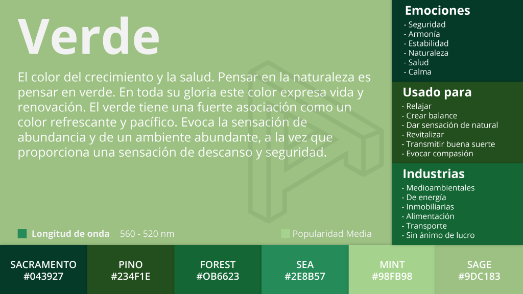
Green
It's nature, vegetation, freshness, and calm. It's the color of nature and of spring. In Spain it's associated with hope.
In design, it's been widely used to convey sustainability and cleanliness, and this isn't always a good thing. Since it dominates the natural world, green takes up a lot of space in the human eye's spectrum. Cameras, and our eyes, are extremely sensitive to this color.
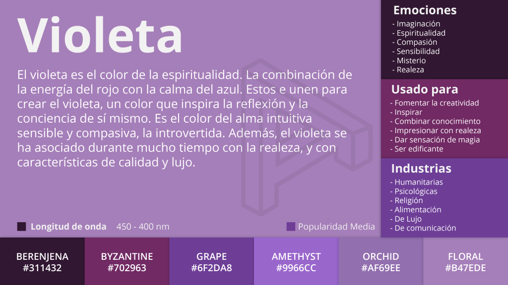
Violet
The color violet is mystery and reflection. It has to do with the spiritual and the emotional, and when used well, it's elegant.
The perfect blend of fiery red and the coldness of blue. Because it's a rare color in nature (and dyes are hard to obtain), it's often considered sacred, delicate, and luxurious.
Frequently asked questions about color theory
When should you use RGB and when CMYK?
RGB for screens and digital environments; CMYK for physical printing.
Is color psychology universal?
Not entirely. It changes depending on the audience's culture, context, and prior experience.
How do you choose a color palette for a brand?
Start from brand values, functional contrast, and consistency across channels, rather than personal taste.
Quick checklist for choosing a palette without going wrong
- Define a dominant, secondary, and accent color (the 60-30-10 rule).
- Validate contrast for readability on mobile and desktop.
- Test your CTA with a high-contrast color against the background.
- Keep color consistency across web, social, and marketing pieces.